The Problem:
KIVA is a micro-loaning non-profit that focuses on providing aid to help improve people’s quality of life through small loans. They are an amazing organization that really focuses on the success of others around the world. In order to attract more users and to continue their success, their current website and mobile view could use a refresh and different layout.
The Solution:
Redesign the KIVA website focusing on mobile-first design, update colors, font and iconography and create an onboarding system to help users understand how to use the website and services.
Role:
UX Researcher
UX Designer
Tools:
Adobe XD
Adobe Illustrator
Miro
Google Suites
User Research
As we started to work on our user research, we began by completing a competitor analysis. We looked at 2 direct competitors: Zadisha and United Prosperity which are micro-loaning companies and 2 indirect competitors: Go Fund Me and Kickstarter which are fundraising companies. Zadisha had a fantastic category section that provides the user with an easy access to a specific type of loan instead of just throwing you a bunch of different loans for you to sift through. This was something that we wanted to be incorporated into our own re-design.
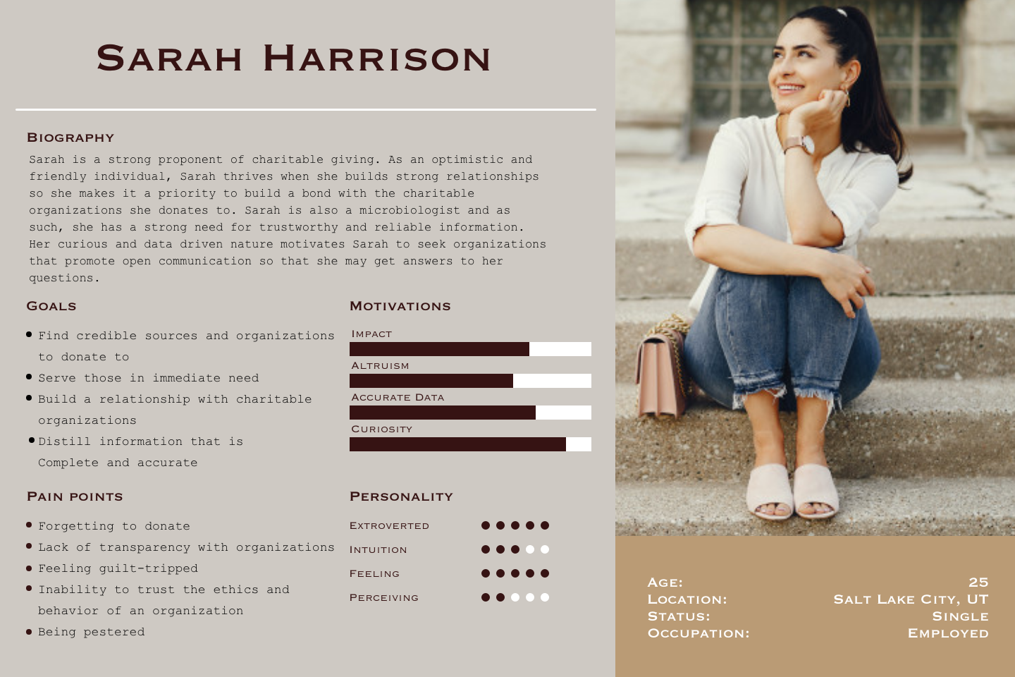
User Persona
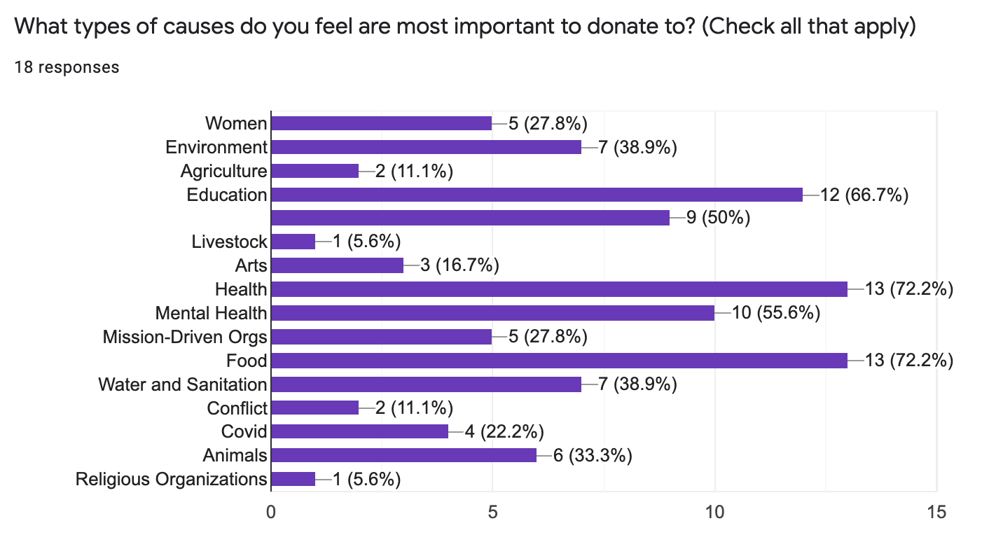
We completed 2 interviews and sent out a survey to 18 participants in relationship to lending and donating money. We learned about spending amount, frequency of donations and causes that appealed most to our participants. Food, health, education and the environment were all at the top of our surveyors lists.
In response to this data, we created a User Persona for our redesign of KIVA.
A question from our survey
User Insight Statement:
Sarah is a graduate student who thoughtfully gives to a variety of organizations focused on health and education. She needs help vetting trustworthy organizations that she can develop a relationship with. Because Sarah wants faith in the organizations through which she is sending support, she must foster trust so that she on relies their insights.
Definition & Ideation
Problem Statement
We believe creating a relationship-driven platform for lenders and borrowers alike will build trust to establish a unified force, enabling underserved communities to fulfill greater financial success. We will know this is true when Kiva's expands its regular lender base.
We created a problem statement in order to guide our redesign and launch us into our definition and ideation phase.
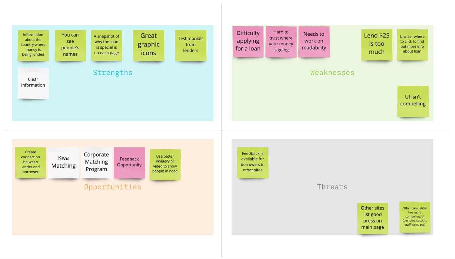
Our team then conducted a SWOT analysis from our previous user research to decide the direction of our redesign.
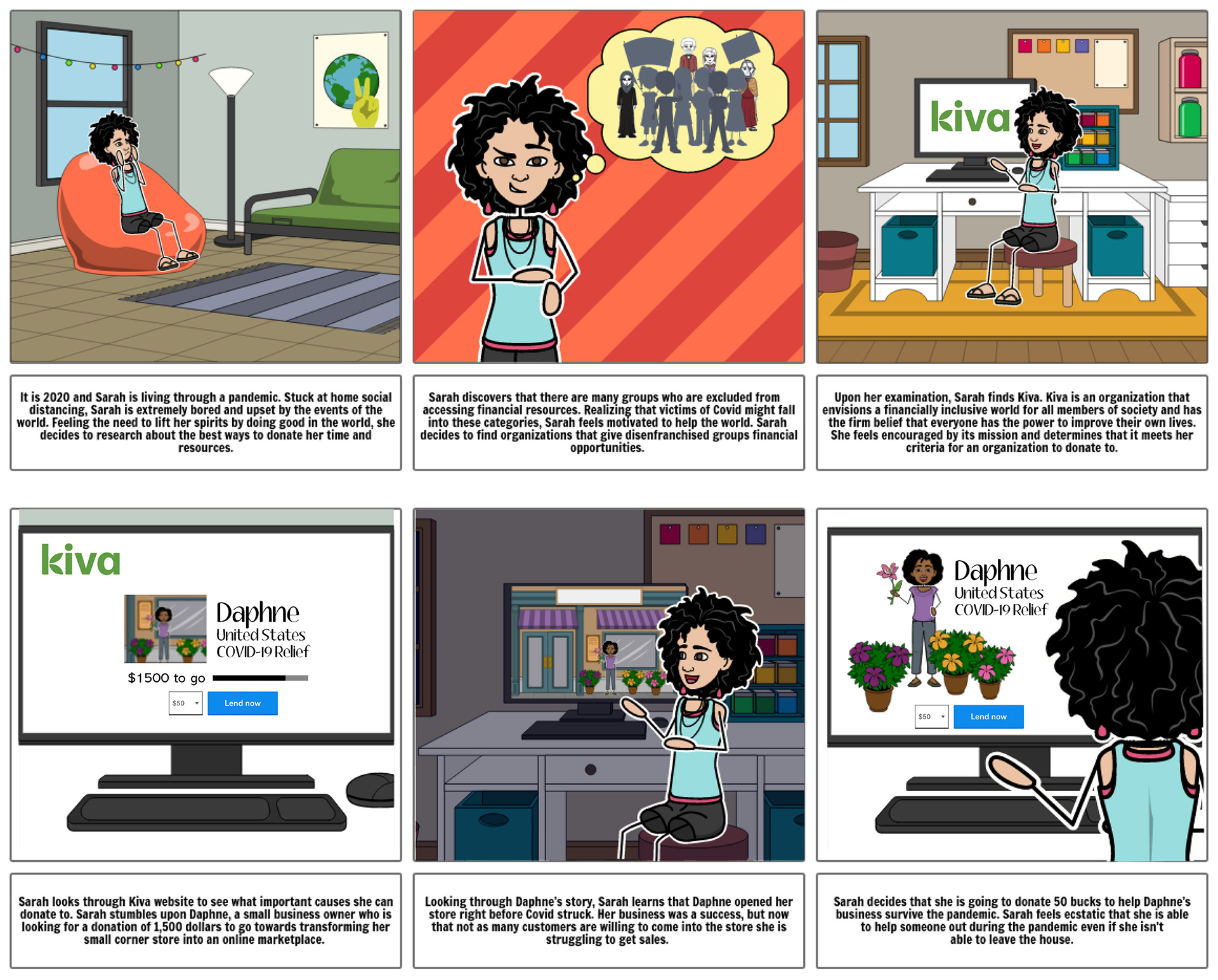
We then created a storyboard to see the impact our redesign of KIVA could have.
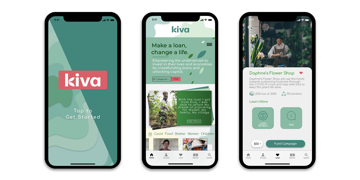
Prototyping
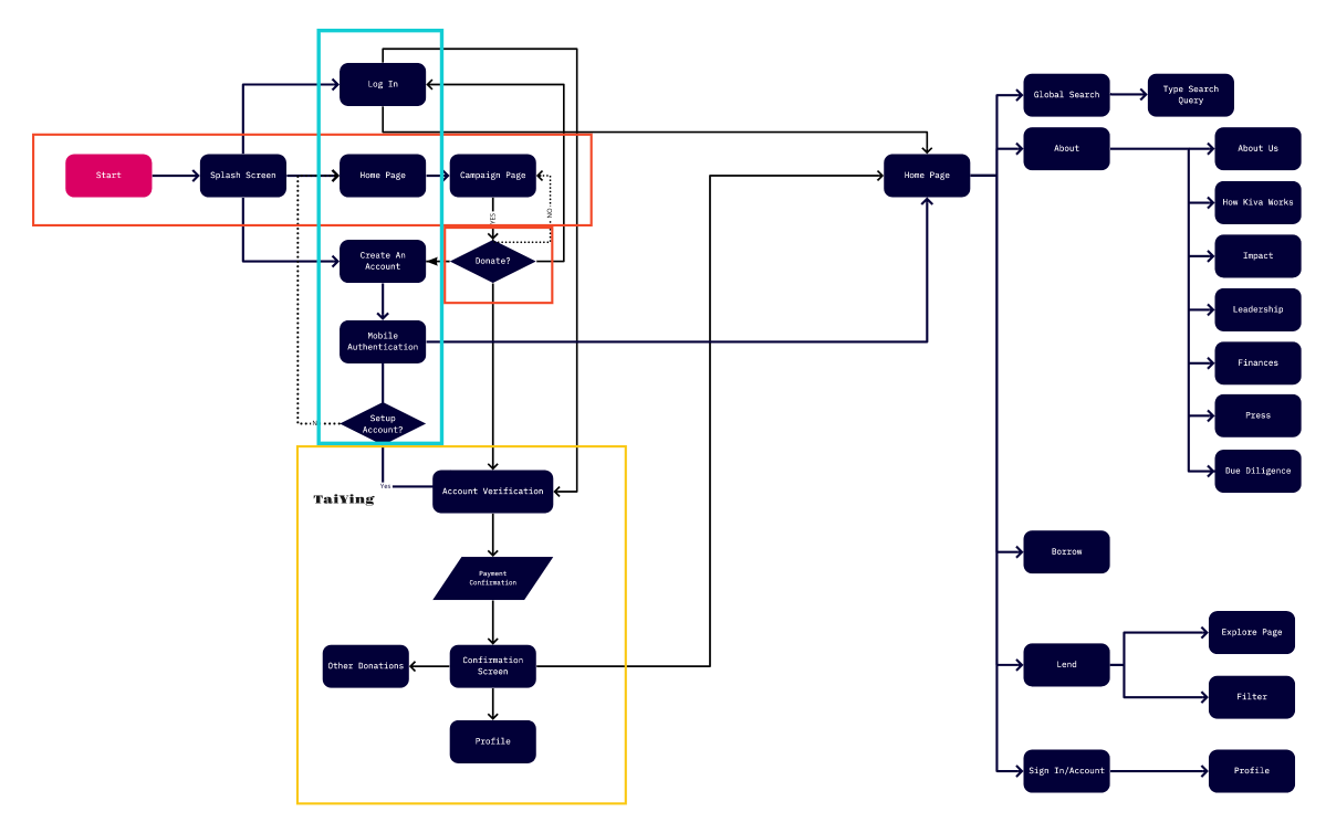
Updated KIVA User Flow
Our user flow leads the user through a few splash screens and into a login/sign-up process. It was important for us to encourage our user to have an account because it will provide ease in storing payment details and a history of who they've loaned money to. We've included pages to verify the user's account and payment to make sure the user's money is safe.
As we created our wireframes and first few iterations of the redesign, we wanted to have rich graphics and an easy to understand navigation.
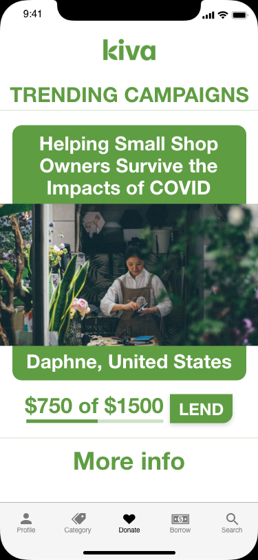
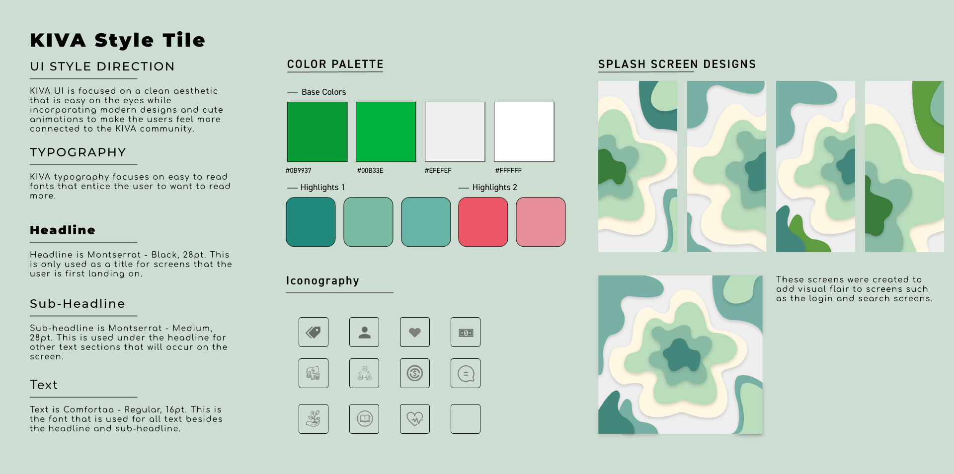
Our styles tile is the culmination of our stylistic ideas. The color scheme is earthy and calming, with a pop of pink to use in our call to actions. We created a layered background on our pages that represent a topographical map, as KIVA serves countries all over the world, and maps can connect us all. It also represents the layers of need in our communities.
Final Iterations & Product
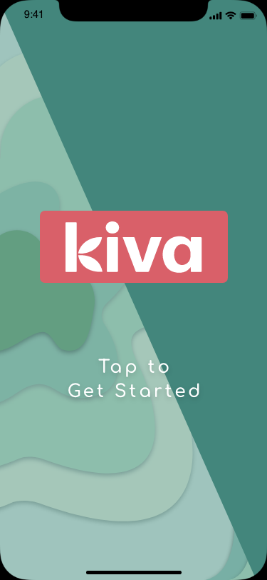
One final iteration we created was to design our splash pages in order to build a relationship with the user by explaining how KIVA works through a set of fun, animated micro interactions. Through our user tests, we learned that informing the user on how the website and organization work were important for user clarity.
Throughout our redesign process, we wanted to make sure our mobile website was easy to use, helped build a relationship with our user and served the main purpose of connecting our users with others that have financial need.
Final Prototype & Final Thoughts
• Relationship of Lenders to Borrowers Important
• Fun to learn about this organization
• Interactive design
• Relatable Scenario
• Great team :)
Next Steps:
• Build out our borrow page
• Link our site to Venmo/Zello
• Incentives for Lenders (create badges to further gamify the website)
• Extra-change feature (Rounding up your donation)
• Reminders/Notifications