The Problem:
The U.S. Department of Education's website is outdated, cluttered with information and difficult to navigate.
The Solution:
Redesign the U.S. Department of Education's website so it is updated, easier to use and navigate, and place the important, often searched for information front and center.
Role:
UX Researcher
UX Designer
Tools:
Adobe XD
Adobe Illustrator
Miro
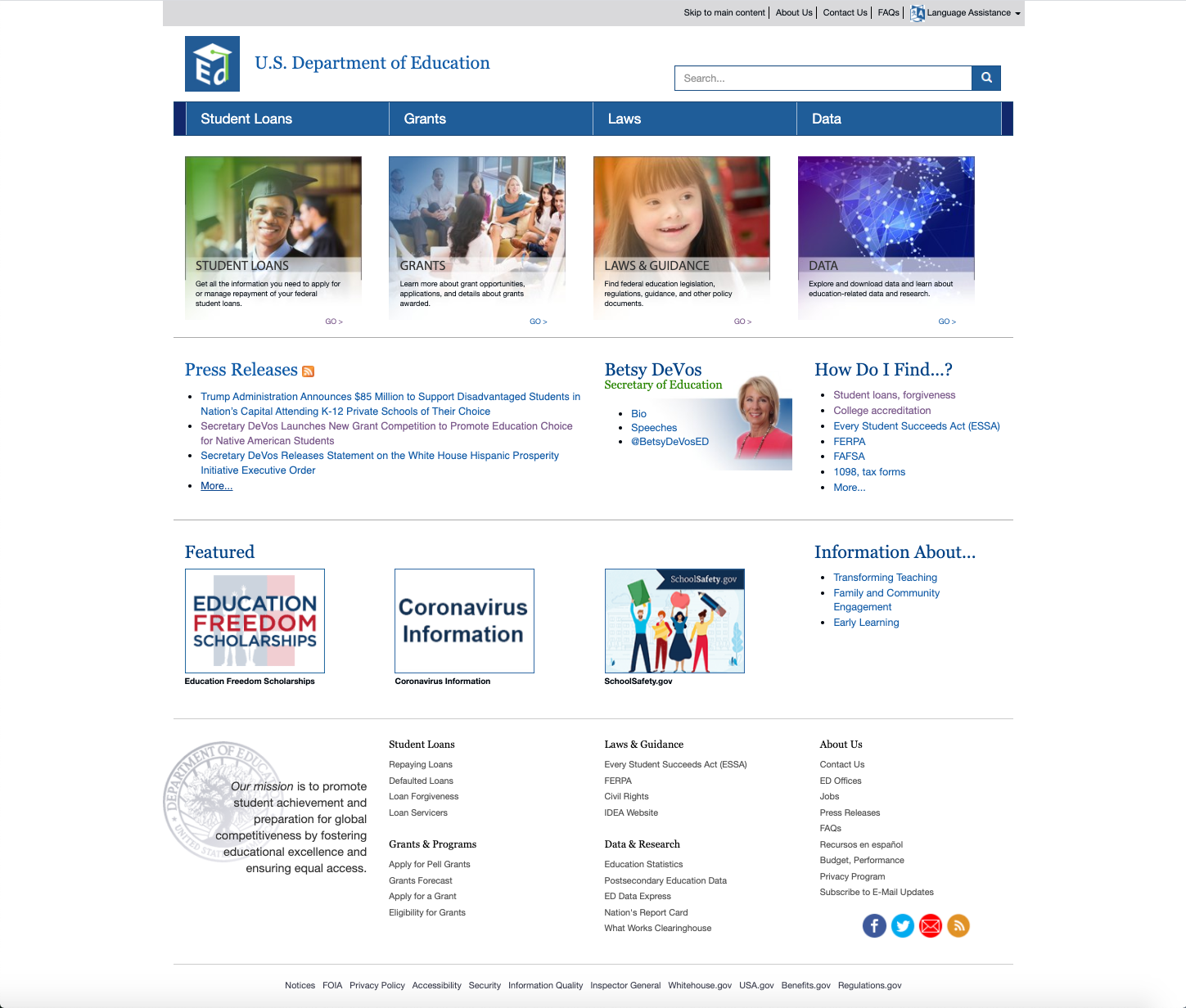
U.S. Department of Education Website July 2020
User Research & Initial User Testing
User research began with the creation of a Proto-Persona to get an idea of the user of this website. While a wide variety of people may navigate to this website, our team thought it would most likely be an education professional who is needing to find resources on testing standards, special education and data sets on the state and national level.
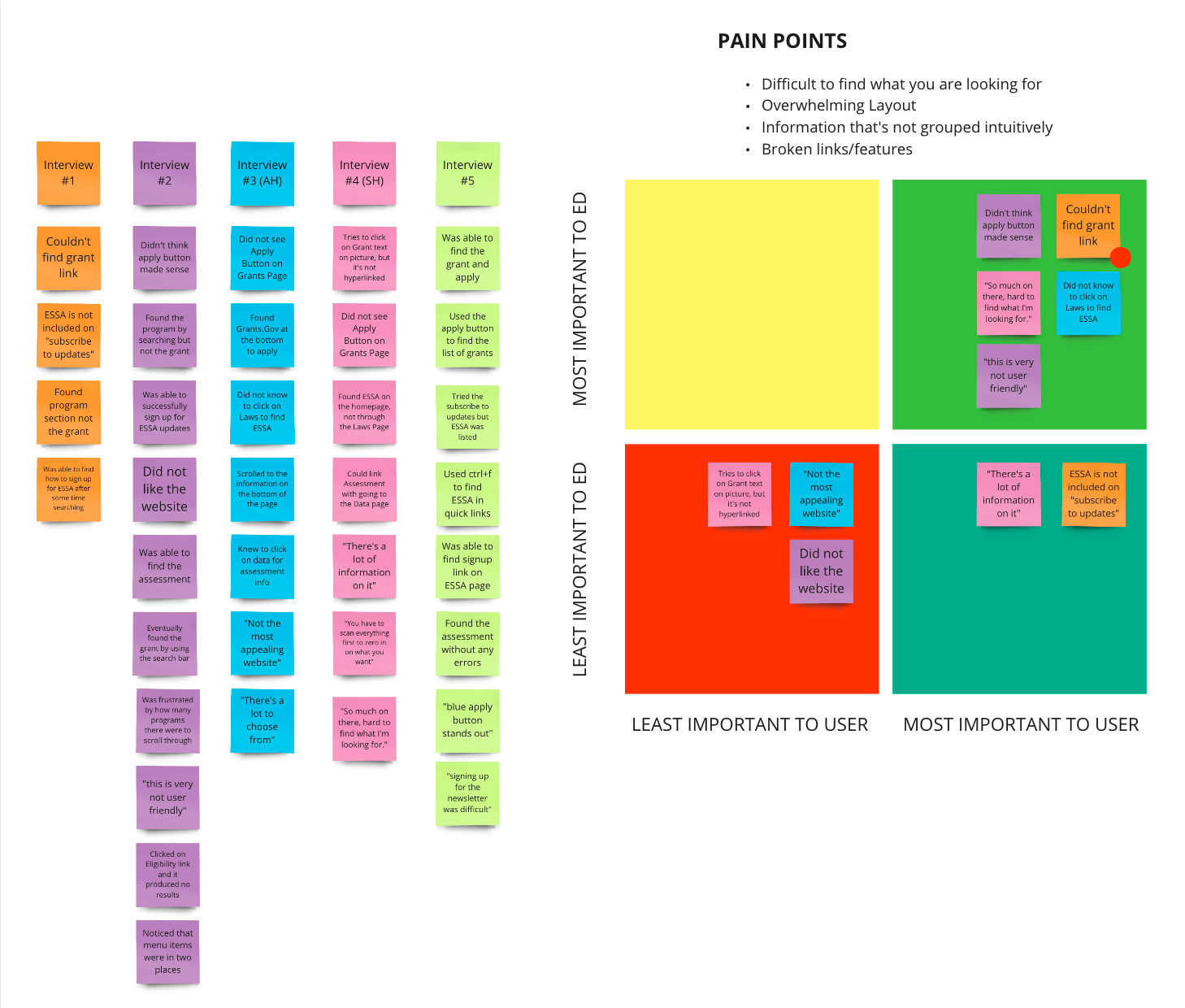
In order to see what changes were needed to the website a series of 5 user tests were completed to see which part of the website could be improved. The main complaints during testing were difficulty in finding how to apply to a grant, having too many options to choose from and not understanding which page had which information.
The break down of our user testing data gave us the following pain points:
• Website was difficult to find what you are looking for
• Overwhelming layout
• Information that’s not grouped intuitively
• Broken links/features
Definition & Ideation
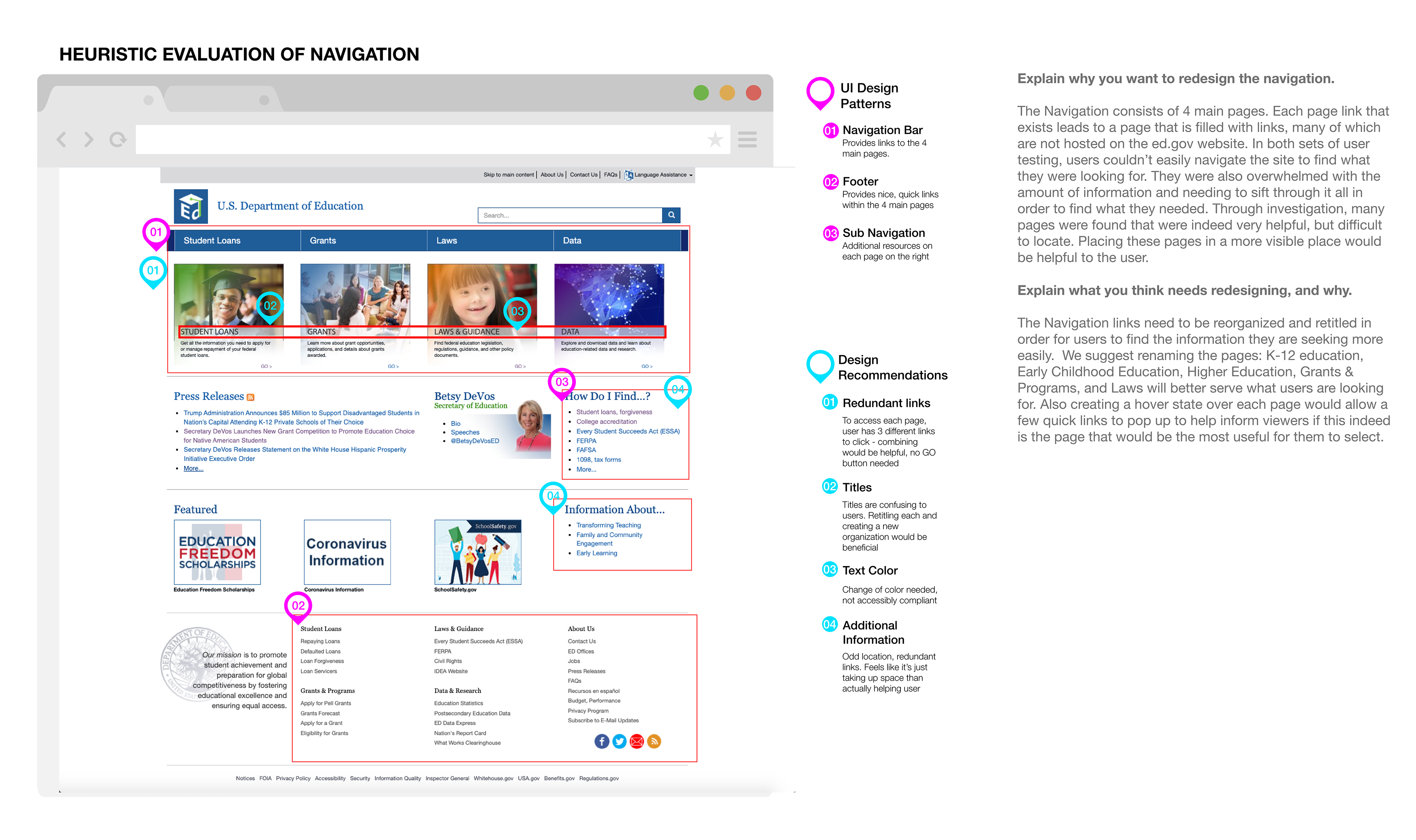
A heuristic evaluation was completed to see UI Design patterns and additionally, two more user tests were completed to just test out the navigation. It revealed a number of design recommendations to be considered in the redesign. The main reasons for a redesign were that each page link that exists leads to a page that is filled with links, many of which are not hosted on the ed.gov website, in testing, users couldn’t easily navigate the site to find what they were looking for, and users were also overwhelmed with the amount of information and needing to sift through it all in order to find what they needed.
The overall suggestions to change were:
• Reorganization of the main pages
• Retitling the main pages: K-12 Education, Higher Ed, Early Childhood, Grants & Programs, Laws & Policy
• Create a hover state for each main page to see what can be accessed on each page
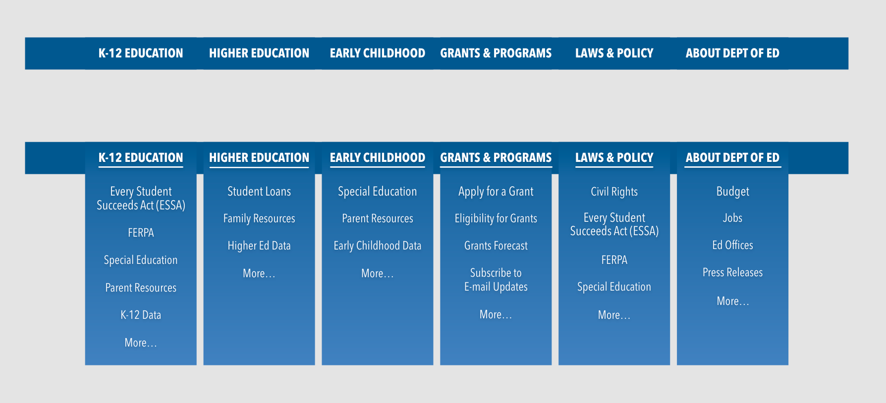
After sorting all of our cards, we grouped them into logical groups.
We discovered that new page titles would make the website’s navigation much more intuitive for our users.
A new structure was created for the navigation system for the US Dept. of Education
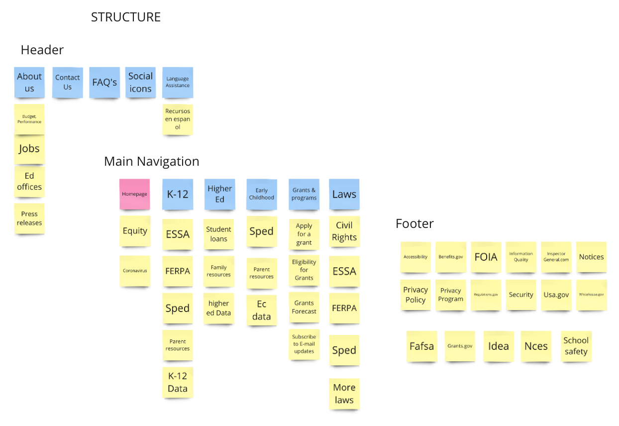
Card Sorting Process
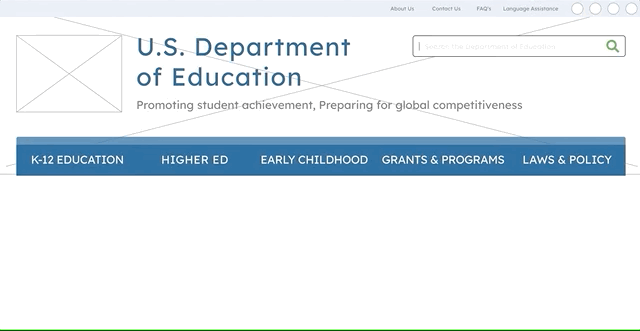
New design and navigation wireframe
Prototyping & Continued Iteration
After an additional iteration of the U.S. Department of Education's navigation adding an "About" page to align with the 12 column UI Grid, a mobile design was prototyped. The Mobile Navigation uses a Hamburger Menu to link to the main pages on the website. When activated and extended with an Overlay, the hamburger menu lets you to select each main page to find popular content on each of the pages.

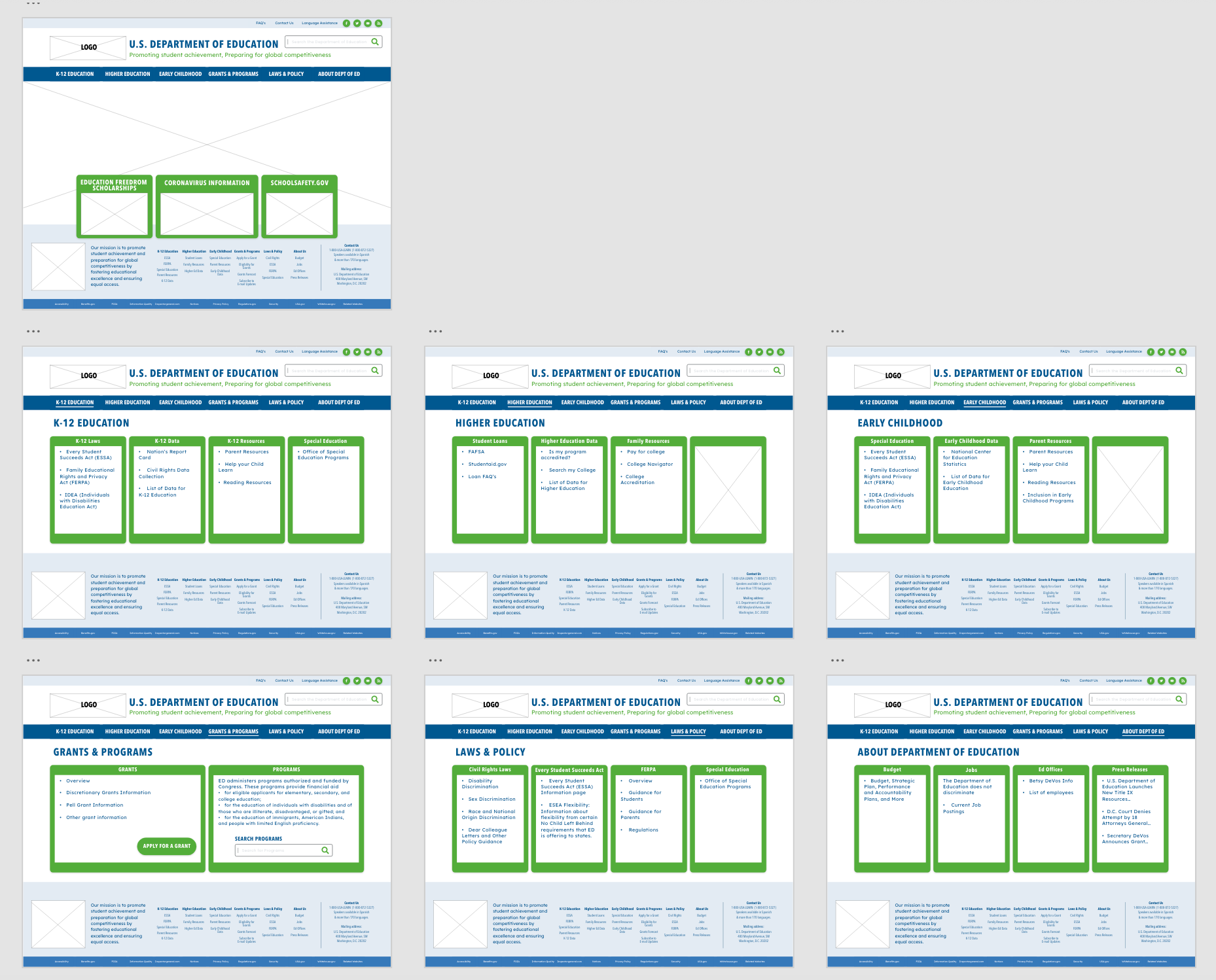
Wireframes of the U.S. Department of Education Redesign
Design & Final Iteration

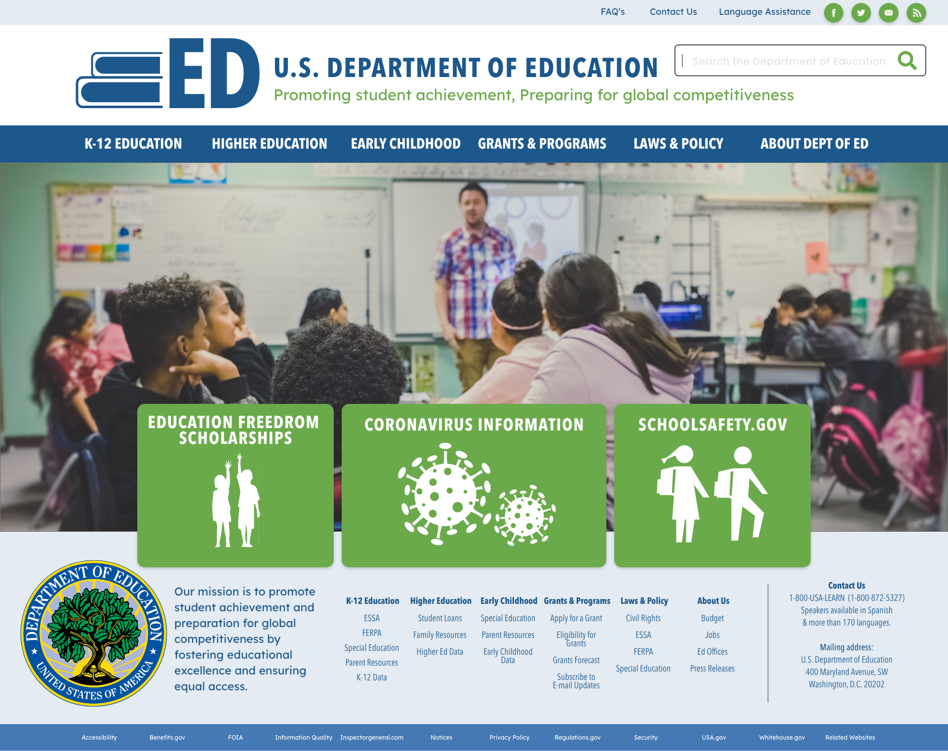
U.S. Department of Education Style Tile
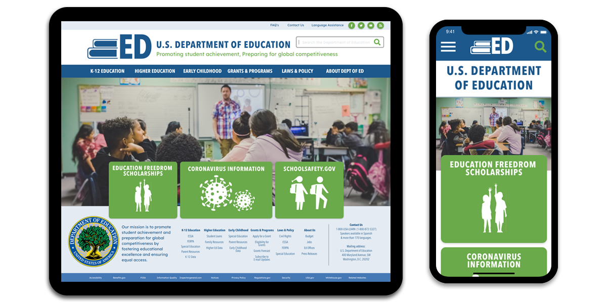
The final design for the U.S. Department of Education focused on a similar color scheme as the original website, an updated logo and updated imagery and icons.

The old logo

Final Prototype and Final Thoughts
Redesigning the U.S. Department of Education's website allowed me to reflect on the importance of being able to easily find information related education in the United States. As an educator, I was so frustrated with how difficult the original website is to navigate. It's extremely important for educators, parents and American citizens to be able to find data and laws that relate to students.
I was so happy to be able to reorganize the website, make it more user friendly and user intuitive, and put the emphasis back on the importance of education.
Next Steps:
• Change the look of the panels on each page.
• Create a mobile navigation that allows you to open multiple dropdowns at the same time.
Add more imagery which captures and highlights the American Education system.