The Problem:
The rate of suicide among young people aged 10 to 24 increased nearly 60% between 2007 and 2018 and with the current pandemic, we are seeing an even greater increase. Throughout the multitude of resources for the general population on mental health issues and suicide prevention, there were no direct resources that directly targeted youth.
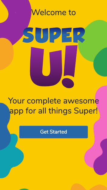
The Solution:
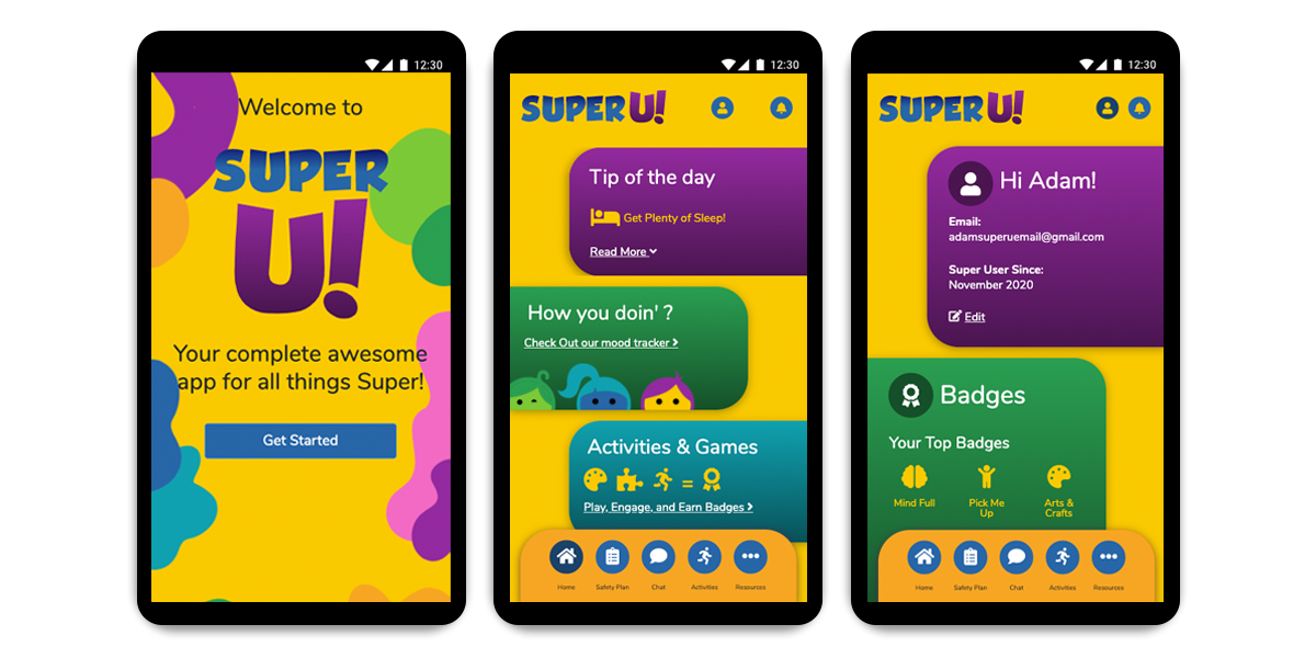
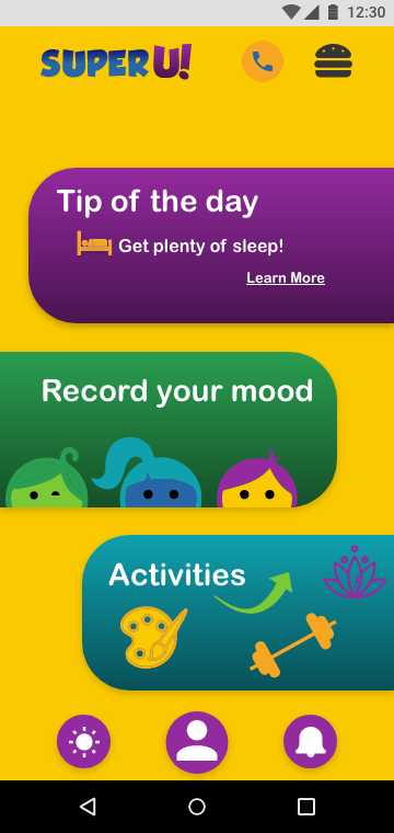
Super U! was created to directly solve this problem. Through the creation of an app that provides daily activities, coping strategies, a mood chart and journal, and resources to access during a crisis, Super U! focuses on the mental health of young people.
Role:
UX Researcher
UX Designer
Tools:
Google Suite
Adobe Illustrator
Adobe XD
Miro
InVision
Visual Studio Code
Github
Bootstrap
HTML
CSS
Javascript
User Research
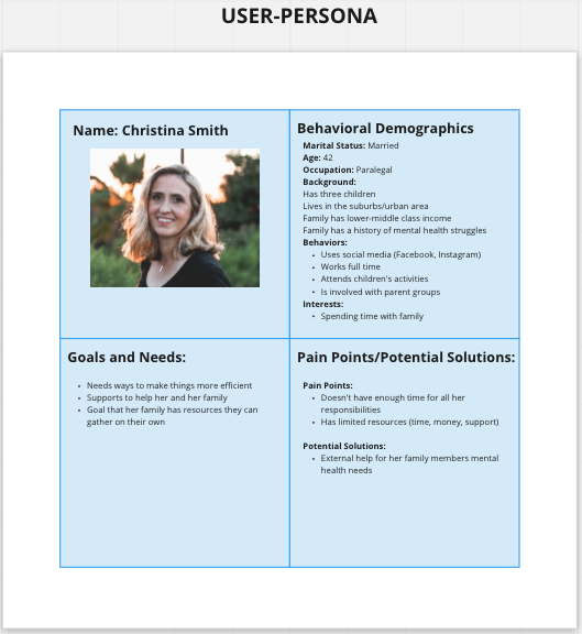
To begin our user research, we first created a proto-persona, who would be the age of the user we imagined our app would reach.
We then sent out a Google Survey which resulted in over 85 responses from youths and adults. We also conducted five User interviews with youth and adults. From our research we found that respondents recognize the growing importance for suicide prevention and positive mental health among youth in our society. However communication between parents and youth can be difficult. One of our interviewees said, "[my son] doesn’t know how to express himself...He refuses to talk to me about what is going on with him."
Some insight that we gained from the survey were that respondents age 25 and above were confident that they are able to talk with loved ones about their mental health and that a majority of respondents age 10-24 said they would seek help for thoughts of suicide or mental health issues. This was a great starting point for the creation of our app.
Definition & Ideation
Problem Statement
We believe creating an app that acts as a supplemental resource for addressing mental health issues among youth will achieve stronger mental health strategies and reduce depression and negative feelings.
SuperU was designed to provide suicide prevention tools. We have observed that our legacy service isn’t meeting the needs for youth, which is creating a hole in our service to our users. How might we improve our youth user base so that they are successful based on downloads/app installs?
After completing our User research we were able to create our Problem Statement. What was important for us was to create an app that works as a supplemental resource for addressing mental health among youth, because our legacy service isn’t currently meeting the needs of this specific age group.
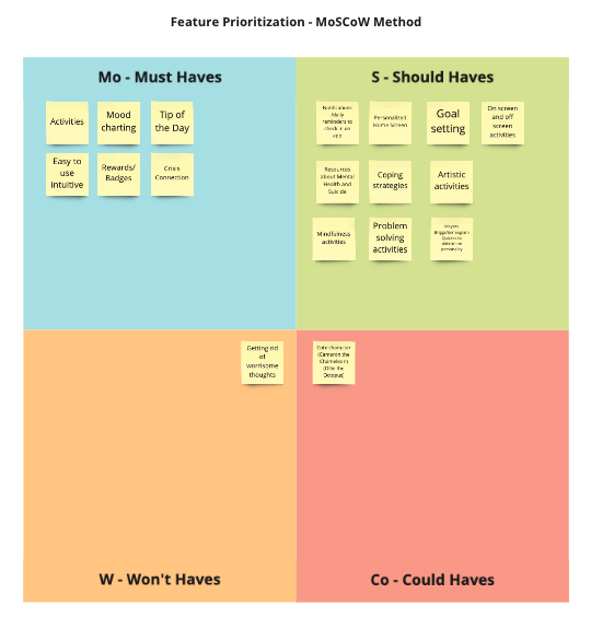
Through our brainstorming process, we completed an I like, I wish, and what if exercise. We then filtered our ideas into a feature prioritization matrix. Creating an app that was easy to use was a must, as well as having age appropriate activities, mood charting and daily tips to help our youth manage their mental health. Gamifying the app was also a must for our age group in order to keep their interest and daily use.
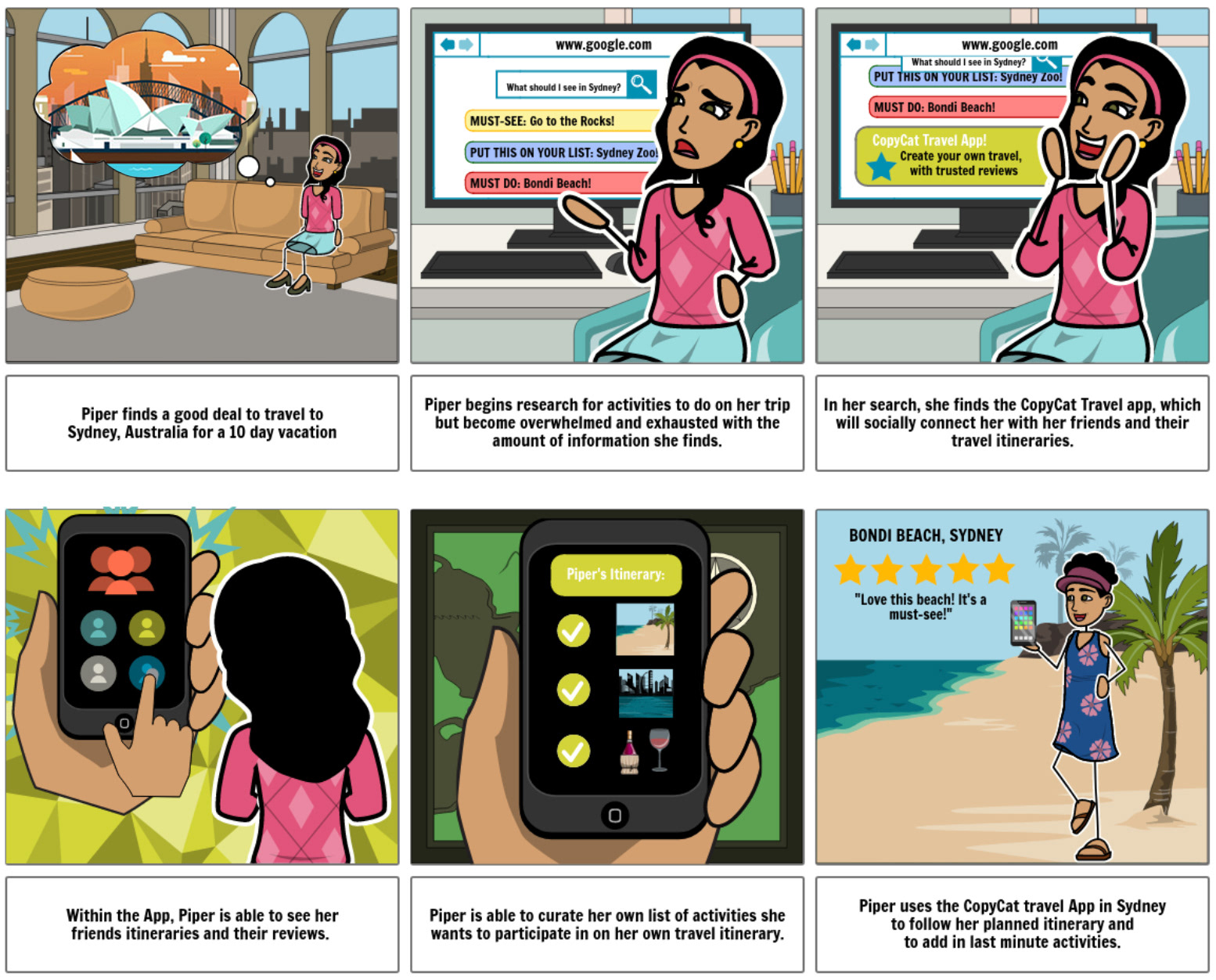
From our user scenario, we created this storyboard to show our app in action. Christina is worried about her son’s mental health so she does research to find mental health strategies in order to help him out. While searching she discovers the Super U! App which has a variety of activities directed at pre-teens. She gives her son this app and as he begins to use it she notices that he seems to be more talkative, active and has taken interest in a new hobby. In the end, Christina ends up sharing this app with her friends with kids around the same age.
Prototyping

As we began to think about design and prototyping it was important to make sure our home screen connected the user to everything. In our sitemap we wanted to simplify the homepage with just a few buttons.
Our wireframes focused on a clear, intuitive layout and an easy onboarding process.
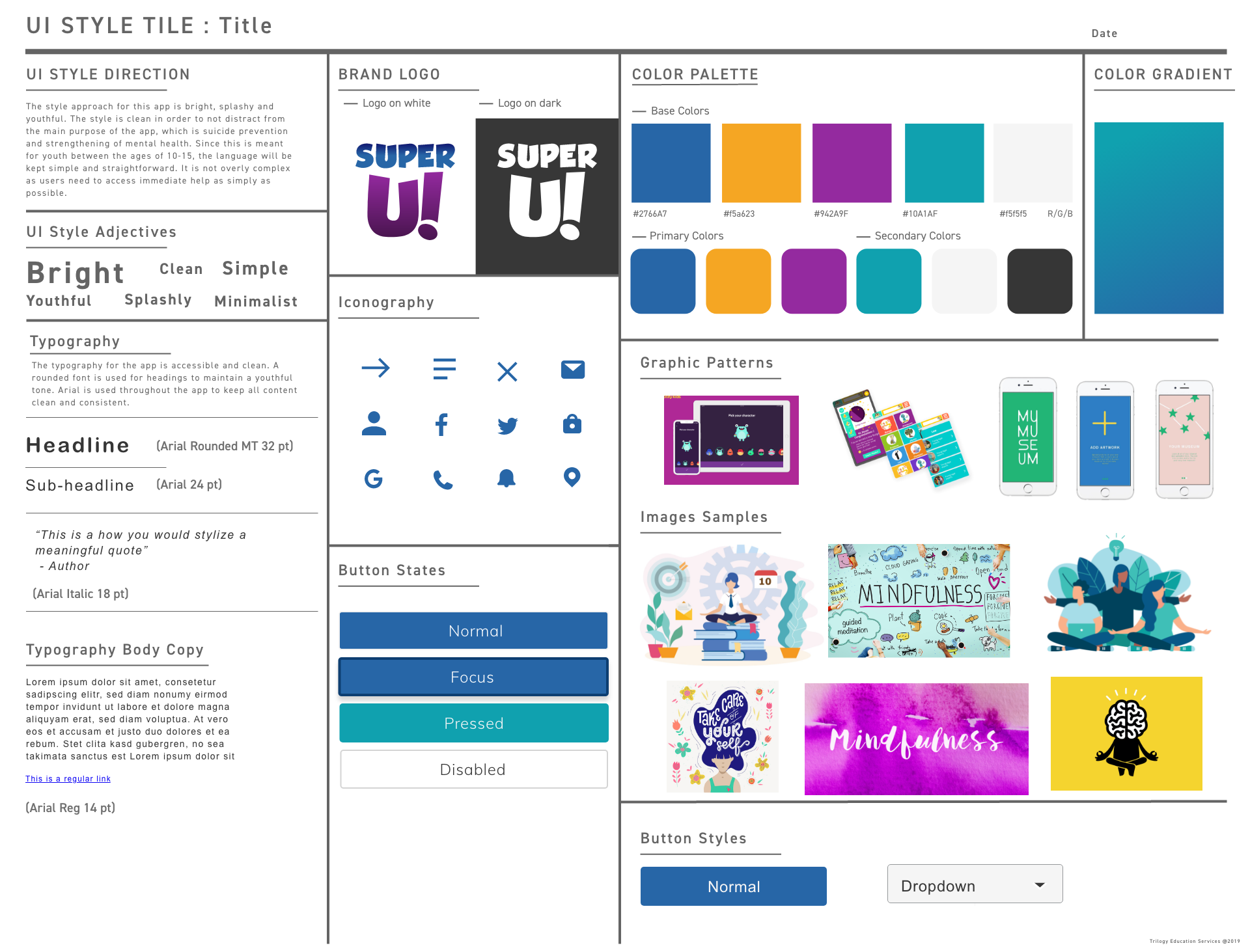
It was important for us to keep this app light hearted because of the gravity of this topic. When creating a mood board and style tile, we did research to see which colors were mood improving and kid friendly. We focused on fun illustrations and easy to understand icons in our designs.
Testing & Iterating
We conducted one user test which led us to find that our app navigation needed to be simplified. We also discovered that some of our icons that led to our key features were misleading or confusing.
We eliminated our top hamburger menu and created a more robust navigation at the bottom to streamline the app. We also added a notifications icon for users to easy access reminders and view progress towards earning badges.
Final Prototype Link to Website
(Because this is intended to be a mobile app, it is best viewed when you inspect the various mobile viewports)
Final Prototype
Our final prototype was coded using HTML, CSS, JavaScript and Bootstrap. As we made final iterations, our previous version didn’t have a link to the activities page in the bottom nav and that was a critical change to improve the user experience.
Final Thoughts
Throughout the creation of this project we kept coming back to the importance of this topic and about how we felt this in general needed more attention. We are happy with the results and all of the details we added and feel like this will appeal to the population we are trying to target.
Next Steps:
We would love to further build within the app:
• an online community and events page,
• integrate the app into schools to help them assess the mental health climate in their districts
• further personalize the app for each user through finding out their interests and needs.